_PNG.png)
A Fresh Look For A New Chapter
- May 14, 2025
- 1 min read

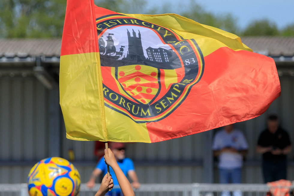
Gloucester City AFC are pleased to introduce our updated club crest which we will be adopting going forwards.
Some small adjustments have been made to help the text, colours and detail to stand out, and to make it a round shape which is more user friendly from a marketing and merchandising perspective.
Chairman Colin Taylor said:
“We didn’t have any need to reinvent the wheel, it’s a refreshed version of the badge which we believe was needed and which we hope will further cement our identity as the City’s football club. Owning the original design files for this badge is also advantageous.
"Thank you to Rob Northcott for his help with this. The old badge will now be phased out over time,
but naturally it will still be around for a while and it’s not too much of a departure from the new one.”


A friend recently mentioned Jalwa Games Login while discussing gaming platforms that work properly during continuous browsing sessions from smartphones online. Yesterday afternoon I spent some free time checking sections and exploring menus from my phone. I also explored extra sections, checked loading speed carefully, and compared the overall browsing experience with several similar gaming platforms available online recently.
KUWIN không chỉ là nền tảng cá cược, mà còn là nơi khơi dậy cảm hứng chiến thắng. Với tốc độ nạp rút nhanh, tỷ lệ cược minh bạch, kuwinblog com luôn khiến người chơi hài lòng. Hành trình giải trí an toàn và trọn vẹn bắt đầu tại https://kuwinblog.com/
A fresh look for a new chapter could symbolize the start of something exciting a change in perspective, confidence, and personal growth. Whether it’s embracing new goals, stepping into a different phase of life, or just updating your daily style, a refreshed appearance can reflect a renewed mindset. Pairing comfort with a touch of streetwear flair might make the transition feel effortless, letting you express yourself freely.
Maybe adding a corteiz tracksuit could give that perfect blend of style and energy, marking the beginning of this new journey. It might just be the outfit that defines your next chapter with attitude and comfort combined.
Steal memes, dodge traps, upgrade skills – Steal Brainrot Online offers a fun and addictive challenge. Play now for free!
A fresh look often opens the door to new possibilities, allowing us to see beyond old limits and explore what could be improved or reimagined. It may bring a sense of renewal, a chance to refine perspectives, and an opportunity to discover paths that were once overlooked. There could be potential in exploring platforms such as targetapplepay org, where innovation and change might shape the way we think about digital convenience and connection. Perhaps, this new perspective could lead to something meaningful, offering a glimpse of progress that feels both uncertain and exciting.